




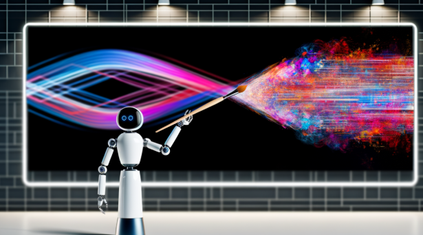
Creating an eye-catching poster used to require advanced design skills, expensive software, and plenty of time. Today, artificial intelligence has changed that process. With the right strategy, marketers, business owners, content creators, and even beginners can turn a simple idea into a polished visual in minutes.
An AI poster maker can help you generate design concepts, experiment with layouts, and quickly explore different visual directions. For example, Adobe Express currently allows users to describe a poster in a text prompt and generate editable template options that can then be customized with branding, images, colors, and messaging.
However, AI alone does not guarantee an engaging poster. The strongest designs still depend on clear communication, visual hierarchy, readable typography, and a strong understanding of the target audience. Research into poster design consistently emphasizes brevity, clarity, readability, and effective visual organization as important factors in communication.
Why AI Is Changing Poster Design
Traditional poster creation often starts with a blank canvas. That can be difficult when you know what you want to communicate but don’t know how to structure the design.



AI changes the starting point. Instead of designing everything manually, you can describe your concept and receive several potential layouts. This makes experimentation much faster.
For example, you might prompt an AI design tool with:
“Create a modern promotional poster for a summer travel sale, using bright colors, a large destination photograph, bold typography, and space for a QR code.”
You can then evaluate the generated concepts and customize the strongest option.
1. Start with One Clear Message
Before generating your poster, decide what you want viewers to remember.
Your poster might promote:
- A new product
- An upcoming event
- A limited-time sale
- A business service
- A social campaign
- An educational message
Don’t try to communicate everything at once. A clear primary message makes the design easier to understand.
Research and professional poster-design guidance emphasize presenting the main message prominently so viewers can grasp the purpose quickly.
2. Write Better AI Prompts
The quality of your AI-generated design depends heavily on the instructions you provide.
Instead of writing:
“Make a business poster.”
Try:
“Create a minimalist business poster for a digital marketing agency. Use a dark background, bold white typography, subtle blue accents, one professional workspace image, and a clear ‘Book a Free Consultation’ call to action.”
Include details such as:
- Purpose
- Audience
- Style
- Color palette
- Visual subject
- Typography direction
- Mood
- Call to action
Specific prompts give you more useful starting points.
3. Create Strong Visual Hierarchy
Visual hierarchy determines what people notice first, second, and third.
A simple hierarchy might look like:
Headline → Main image → Key benefit → Call to action
Make your most important element the largest or most visually prominent. Use size, contrast, positioning, and spacing to guide the viewer through the poster.
Research on poster layout shows that balanced composition and appropriate text density can improve visual attention, while overly dense designs can make information harder to process.
4. Keep Text to a Minimum
One of the biggest mistakes in poster design is treating the poster like a webpage.
People should not have to read a wall of text to understand your message.
Instead of:
“Our company provides high-quality digital marketing solutions designed specifically to help growing businesses improve their online visibility and reach more potential customers.”
Try:
Grow Your Online Reach
SEO • Content • Paid Media
Book Your Free Strategy Call
Shorter copy creates more breathing room and makes the main message easier to notice.
5. Use Contrast Strategically
Contrast makes important elements stand out.
You can create contrast through:
- Light and dark colors
- Large and small text
- Bold and regular fonts
- Photography and empty space
- Different shapes
- Color accents
However, contrast should have a purpose. If every element is bold, colorful, and oversized, nothing feels important.
6. Choose a Consistent Color Palette
AI tools can generate visually attractive combinations, but you should still make sure the colors fit your brand.
A simple approach is to use:
- One primary color
- One accent color
- One neutral background
- One text color
For branded campaigns, reuse your established colors across posters so customers can recognize your content more easily.
7. Use High-Quality Visuals
Your main image often determines whether a poster feels professional.
Choose visuals that directly support the message. If you’re advertising a restaurant, showcase the food. If you’re promoting a technology product, feature the product or an image that communicates its benefit.
Avoid adding decorative images simply because there is empty space.
Professional poster guidance also recommends using strong visuals and limiting unnecessary text rather than overcrowding the layout.
8. Leave Enough White Space
Empty space isn’t wasted space.
It gives individual elements room to breathe and makes your poster easier to scan. One university poster-design guide recommends leaving roughly one-third of a poster as negative space to avoid crowding.
If your AI-generated design feels too busy, remove elements rather than adding more.
Try deleting:
- Unnecessary icons
- Decorative shapes
- Repeated information
- Extra fonts
- Long paragraphs
Often, removing 20% of the design can make the remaining 80% much stronger.
9. Make the Call to Action Stand Out
If your poster is designed for marketing, don’t make viewers guess what they should do next.
Use a direct CTA such as:
- Shop Now
- Register Today
- Scan to Learn More
- Get Your Free Guide
- Book a Consultation
- Visit Us Today
Give the CTA enough contrast and spacing that it can be found immediately.
10. Generate Multiple Versions
Don’t settle for the first AI design you receive.
Create several variations with different:
- Layouts
- Images
- Color combinations
- Headlines
- Typography
- Visual styles
Adobe Express’s current AI poster workflow allows users to generate template options, select a preferred result, and customize it further. It also supports generating fresh variations when the first results aren’t quite right.
This makes AI particularly useful as a creative brainstorming partner.
Test Before You Publish
Before printing or posting your poster, shrink it down and view it on a phone. Ask yourself:
- Can I understand the message immediately?
- Is the headline readable?
- Does the main image support the message?
- Is the CTA obvious?
- Is anything unnecessary?
- Does it look consistent with my brand?
If possible, show the poster to someone who knows nothing about the project. Ask them what they noticed first. Their answer can reveal whether your visual hierarchy is working.
Final Thoughts
AI poster design makes professional-looking visuals more accessible, but technology is only part of the equation. The most engaging posters combine AI-assisted creativity with strong fundamentals: a clear message, effective hierarchy, readable typography, purposeful imagery, contrast, and enough negative space.
Use an AI poster maker to explore ideas quickly, not to replace your creative judgment. Generate multiple concepts, choose the strongest direction, and refine every important detail around your audience and brand.
When you combine smart prompting with thoughtful design decisions, AI can turn a basic concept into a poster that doesn’t just look good—it communicates clearly, captures attention, and encourages people to take action.